Welcome back to Marylou Sobel Interior Design for 2016. I hope you had a meaningful and peaceful holiday season. I cherish that time of year for the opportunity it allows me to spend time with the most important people in my life.
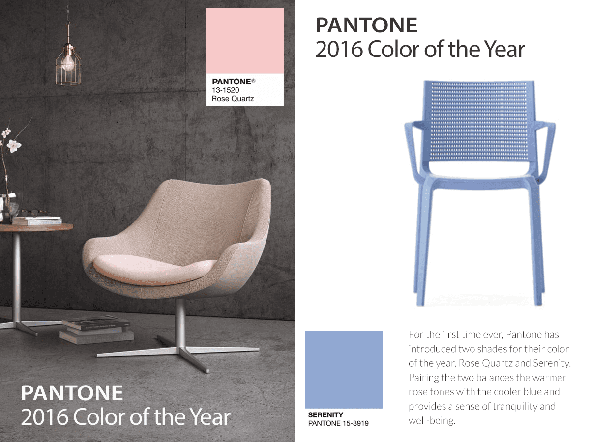
The start of the new year can be bitter sweet – the time just spent with loved ones comes to end, but there is so much to look forward to in the year ahead. And there really is – starting with my first blog of 2016 on one of my favourite topics – colour! More specifically, about the exciting announcement of Pantone’s Colour of the Year – or should I say colours of the year! For the first time ever, the highly respected and important annual selection by the iconic colour trendsetter, Pantone, is for two colours, not the typical one. This year they have chosen the colours Rose Quartz (a shade of pink) and Serenity (a shade of blue).

Pantone Colours of the Year: Rose Quartz & Serenity
This is not controversial, but it is unusual. Personally, I am intrigued. I love both colours individually – and together they are spectacular. They are wonderfully calming and peaceful. Pantone have said that the two colours were chosen to challenge ‘traditional perceptions of colour association’. I like the idea that the choices, while they do have a feminine feel, create something of a gender blur, resulting in a positive and encompassing colour combination.
Pantone systems have created a universal language of colour, and each year, with their Colour of the Year selection, they create a trend that reaches beyond interiors into all spheres of design. Its relevance is unparalleled; the colour choice reflects current cultures and social movements and helps guide the creative processes of designers worldwide. I value it because it opens one’s eyes to new possibilities and change. For interiors, applying the Colour of the Year can help freshen up or modernise a home, keeping decorations on trend. I think the colours, coupled with the right palette, could complement any room. I would equally love to see them used to accessorise a room as be used for a feature wall (or more) – as long as the calming aesthetic they bring continues throughout the home.
The colours put to use on furnishings
When it comes to applying the colours to projects, the client’s tastes – essentially, the brief – will determine how they are used. And their uses are pretty much endless – from paint finishes and tiles, to artwork and flowers; they are versatile. The colours would look equally beautiful in light, floaty fabrics, as they would in linen or velvet. It is the change of texture that adds interest and I personally love layering textures for maximum effect, comfort and luxury.
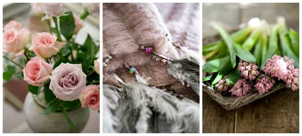
The colours can be used in darker and lighter shades of the originals . . .be inspired!
The style of home can help guide the specific application; for example, in a contemporary home or office, rose quartz linen would work well; while silk in the same tone would work for a French châteaux style home. Of course, in saying that, any time you add colour to an existing room in a home, you must acknowledge that every colour and hue tells a different story and gives a different feel, so you must be acutely aware of what already exists in the room.
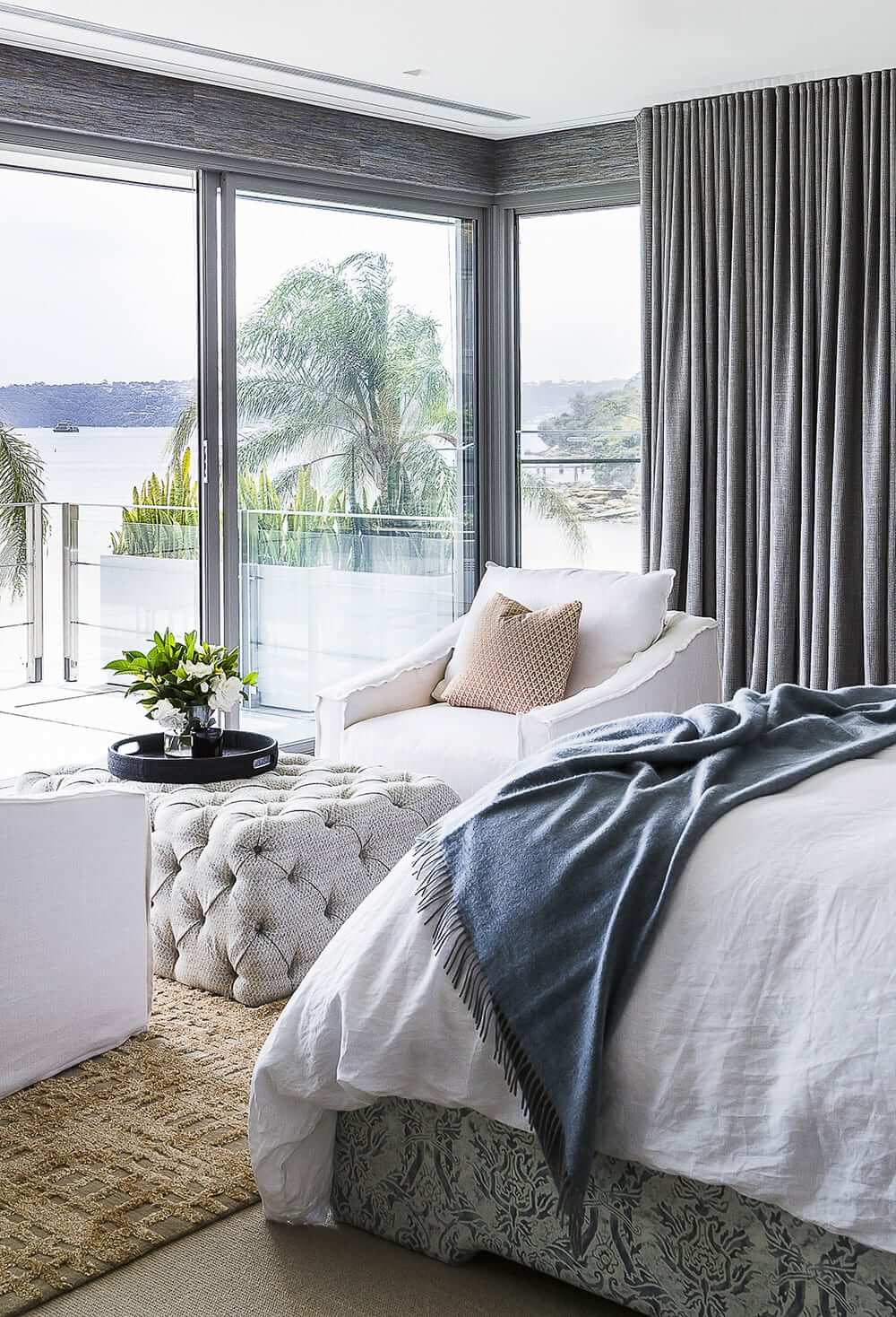
Accessories in Pantone inspired colours are an easy way to keep a room on-trend.
Colour affects mood, and the calming nature of the Pantone colours would be perfectly applied to a nursery or child’s room – but of course they aren’t limited to those rooms, and are being used to great effect in living rooms, bathrooms, and more, in many homes.
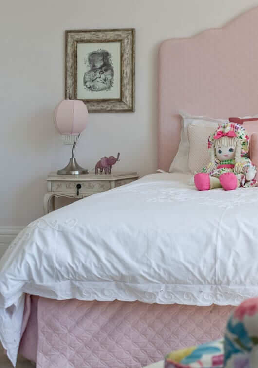
The calming nature of the colours, alone or together, make them ideal for a child’s room.
Whichever application is used, these lovely colour choices are certain to bring another element of beauty into your home.
Images:
Rose Quartz and Serenity images courtesy of Pantone; All other images from Marylou Sobel Interior Design.